United’s Livery Change is Barely Worth Mentioning, And That’s How United Wants It
The day has finally arrived. United has been talking about its livery refresh for some time, and we know what it looks like. I have to say thanks to United for rolling it out yesterday, because I went on vacation last Friday and completely forgot to schedule a post for this morning. I’m back today, but this gave me some easy fodder. So here’s a somewhat-abbreviated post. Let’s start with the description of the look.

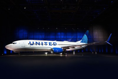
If there is one over-arching theme, it’s “blue.” The livery is now dominated by Rhapsody Blue, United Blue, and Sky Blue. The belly is painted Runway Gray, but that’s really a holdover from the old livery. The point here is that blue becomes much more prominent.
I’ve seen a fair bit of discussion about how disappointed people are, but why? United always said this was an evolution, not a revolution. Here’s what it looks like on the first airplane:
Are you underwhelmed? I suppose I am too, but I just have trouble caring all that much. I don’t have any particular issue with this refresh, but I just don’t know why it’s even worth doing.
It was a given that the logo and font would stay the same. If you change the font or logo, then you need to spend a ton of money on everything from business cards to bulkheads. That was never going to happen. So if the logo and font remain the same, then what changes?
First, the font gets bigger. Instead of sitting above the windows, the name now gets larger and bluer, and that makes sense. At the same time, United has adopted the swoopy cheatline that was already on the 787 and 737 MAX aircraft.
Other than that, the big change is that the gold color has been killed. Instead of a gold-tinged globe on the tail, it’s just all blue. Gold is nowhere to be found anywhere on the livery at all.
The final touch is a tagline near the first entry door on the left. Instead of “worldwide service” as on the old United, it will now say “Connecting people. Uniting the world.” Gimmicky? Maybe, but it’s pretty harmless.
This is a perfectly fine update, but I don’t know that it really changes anything. I still think United should come up with a new logo to help heal some of the merger wounds, but that is far more expensive and challenging, so it’s hard to fault the effort to simply update what’s already out there.
As far as updates go, this isn’t bad. It’s just also nothing special. I suppose that’s what United was actually aiming for. It’s certainly not offensive. Some will love it, others won’t. Many will be indifferent. But it’s a decent update to something that was getting fairly long in the tooth. I’m just not sure this is enough of an update to matter.
When it comes to liveries, employees care more than anyone. If this helps morale somehow, then great. It doesn’t need to inspire anyone on the outside. If this gets the employees excited, then it was worth doing.


